KOTEX PERIOD UNDERWEAR
How does an unfamiliar menstrual product from a trusted brand gain broad appeal across diverse global markets?
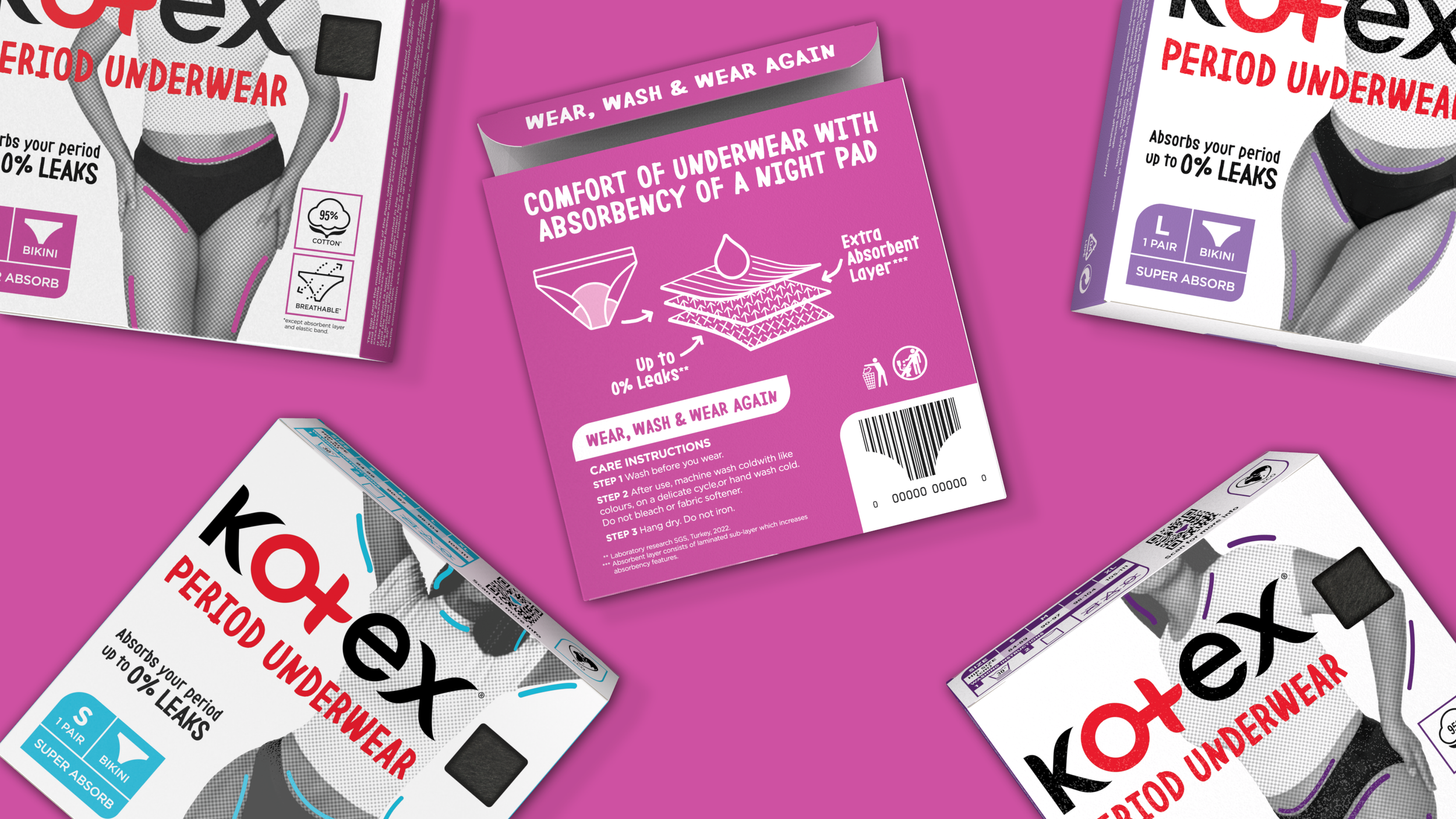
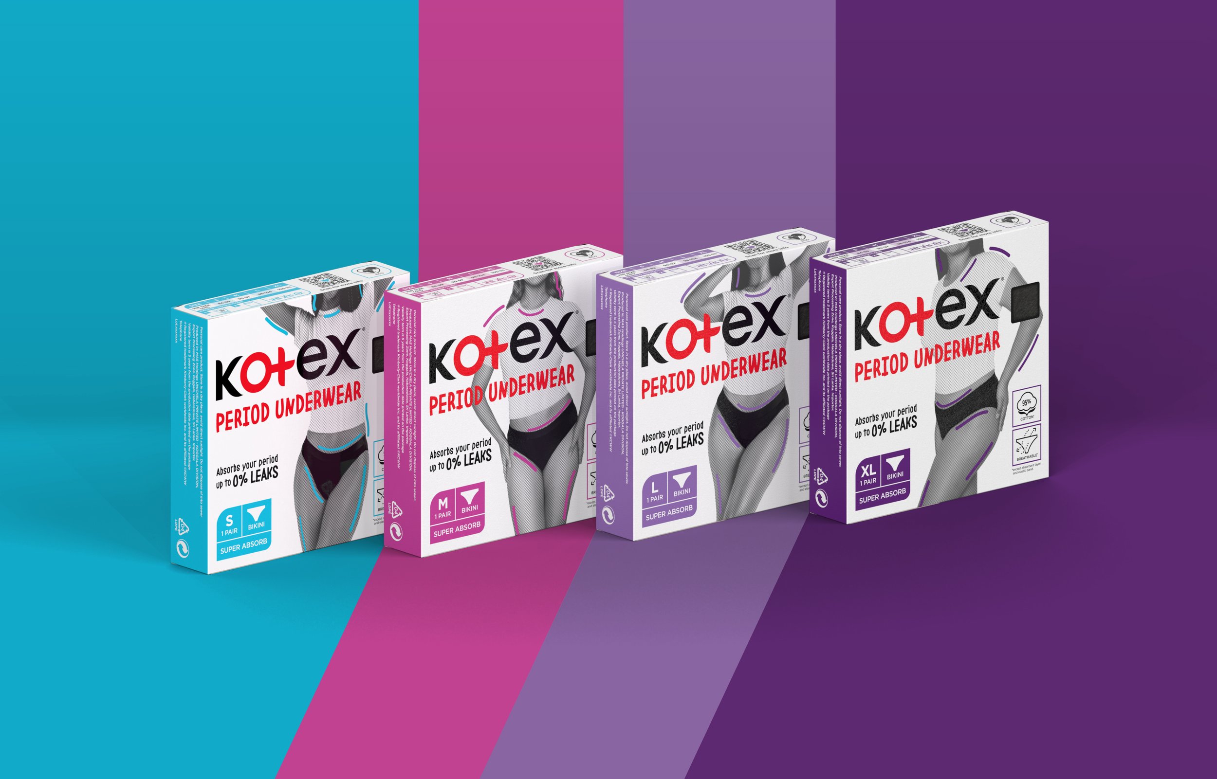
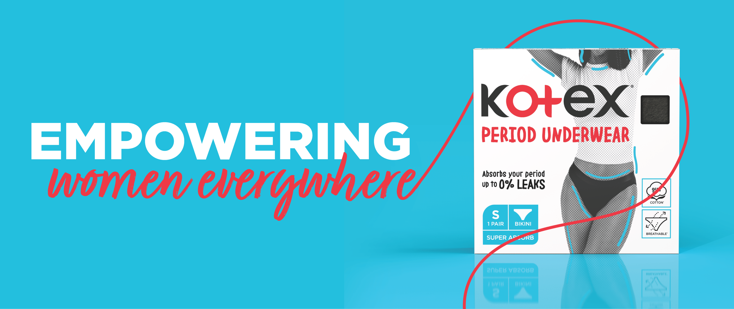
Kimberly-Clark’s Kotex created a line of period underwear—comfortable, washable and reusable cotton panties meant to replace or supplement traditional menstrual hygiene products like pads or tampons. And for the first time, they would be available in Europe, the Middle East, and Africa (EMEA). The line extension faced two challenges. One, helping consumers understand the product and its benefits, and two, creating appeal across some of the most culturally and economically diverse regions in the world. Consumer insights revealed the packaging needed to feel inviting and empowering and ensure the product looks comfortable. The design solution is clean and simple but powerful with subtle colors, photography that conveys comfortable confidence for bodies of all shapes and sizes, and hand-written typography that invites the consumer on a personal level.
Client
Kimberly-Clark | Kotex
Category
CPG | Personal Care
Services
Design Strategy
Package Design
Brand Assets, Imagery, & Photography
Realization & Commercialization
Awards
GDUSA | 2023 Graphic Design
GDUSA | 2024 Packaging
Background
Wolf Spirit Distillery, an independent Oregon-based craft spirits distiller, decided to launch a new craft Gin. They knew breaking through in a crowded category dominated by large heritage brands would require shattering some long-standing attitudes—if not making fun of them. Being different is easy. But being both different and relevant is far more challenging.
A Certain Kind of Consumer
Gins have long been traditional and grounded in heritage—often associated with history and even royalty. Yet, its appeal to a more eclectic cocktail drinker has grown recently. This new generation of Gin drinkers is quirky, free-spirited, and loves taking the road less traveled. A craft Gin from the Pacific Northwest would likely be very enticing for them. And this consumer serves as the inspiration for a charmingly offbeat brand expression.
A Real Mascot with a True Story
Wolf Spirit’s Master Distiller has a beloved dog. But Mr. Pickles isn’t just any dog. He’s a rescued Pitbull and a lot like Ben. He’s a misunderstood contradiction; he appears tough and intimidating, yet he has a warm & loving heart, is funny, a great friend…and is the perfect namesake for a brand to embody this personality.
Victorian Tradition, yet Charmingly Warm and Eclectic
Across the brand identity, from packaging and displays to social media and the web, Mr. Pickles takes center stage. He’s framed lovingly and illustrated in a rich, colorized Victorian portrait style, along with his favorite spiked collar, inspiring the unique gold stopper design.
At first glance, he appears a tough guy, but look closer, and you can see that he’s a tail-wagging good boy, as loving as the flowers surrounding him. They tell the story of a devoted companion but also of the distinctive Pacific Northwest botanicals that deliver a flavorful yet exceptionally smooth drinking Gin experience.
Bark the Bark
Visually, the brand walks the walk. It also talks the talk via its tone of voice, which comes alive in clever, cheeky language. The tagline “All Bark. No Bite.” brings the strong yet smooth character of the spirit home, as does the consistent appearance of “...surprisingly smooth, kind of badass, and easy to fall in love with.”
Early Results
Newly launched—late July 2023—it’s still early to record significant results. Yet, retailer reception has been very strong, including strong buy-in among top 5 US supermarkets who also sell spirits.